Welcome to the place where my heart and soul reside! This is where I come to write about and showcase ALL things that make a mark on me – things that are chic, beautiful, inspiring, and totally unique in the Luxury Wedding and Event Planning industries! This is also the place to find inspiration and tips from our Creative Partners. Often, the wedding and fashion worlds intertwine. So occasionally, I’ll include my favorite fashion finds, trends, and current obsessions. My desire is to give you a peek into a world that has always fascinated me and continues to excite me! Welcome to The Bridal Circle blog.
Perfect Palettes: Printing Pretty With A Stylish Selection of Seasonal Color Emilie Dulles & Dulles Designs
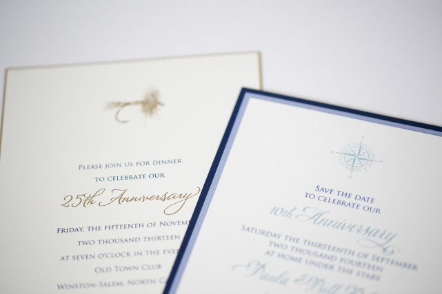
The warm woodsy feel of autumn has us craving some pretty seasonally-inspired stationery selections. From festive metallics in copper tones or golden foil-printed details inspired by sunkissed stalks of blonde wheat, the sense of harvest in engaging tabletop menus, escort cards, notecards or invitations adds a beautiful sense of home and seasonality to any stationery item. The texture of fine papers and luxurious letterpressing itself adds to the overall feel and impact of entrancing autumnal designs.
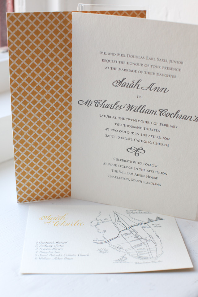
Emilie Dulles of Dulles Designs incorporates a lovely sense of style into her fall-themed stationery palettes. Often utilizing the rich, full cream of exquisite paper stock, Emilie pairs the surface with earthy browns as well as tantalizing rust and orange hues. Patterning is played up as a sophisticated way to incorporate larger panels of color. Spot illustrations pressed in a single color add an elegant little sense of location or time of year. We love the limited palette and pared-back aesthetic of Emilie’s designs. This approach l
eaves clients with a heightened sense of the intricacy and high quality of the designs themselves.
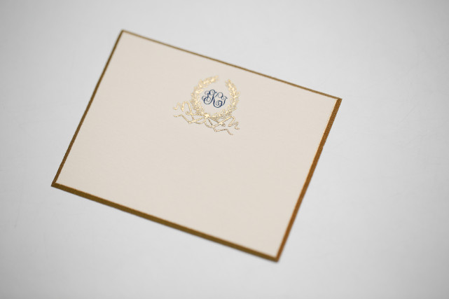
Mailer liners are another beautiful way that Dulles Designs adds a colorful and sometimes festive flair to invitation suites. In metallics, patterns, or even interesting textures, a simple liner can be as transformative as the varied fonts Dulles Designs employs in maintaining the bespoke quality of each design. Additionally, we love the hint of color used to tint the edges of some of Emilie’s most charming pieces. Tinting the edge of a design creates the perfect addition of a little color or a pop of metallic shine to tie envelope and card together.
For an air of added elegance and a fabulously stylish tabletop, it’s impossible to go wrong with Dulles Designs. We’ve included some lovely details from exquisite Dulles Designs invites below. Our personal favorite just might be the invitation calligraphed in white on thick, chocolate card stock with a vintage-gold foil edge.
We cannot wait to hear about your personal Dulles Design favorites!
