Welcome to the place where my heart and soul reside! This is where I come to write about and showcase ALL things that make a mark on me – things that are chic, beautiful, inspiring, and totally unique in the Luxury Wedding and Event Planning industries! This is also the place to find inspiration and tips from our Creative Partners. Often, the wedding and fashion worlds intertwine. So occasionally, I’ll include my favorite fashion finds, trends, and current obsessions. My desire is to give you a peek into a world that has always fascinated me and continues to excite me! Welcome to The Bridal Circle blog.
A Website Revamp for Michelle Rago Destinations
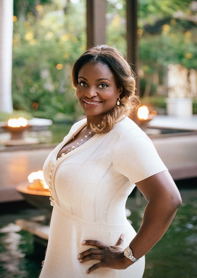
BY MELISSA PAUL
In today’s world of over-saturation, a business succeeds if it produces a consistent brand aesthetic across multiple platforms by incorporating culture, presentation and interaction. In other words, know who you are. Then keep it simple and keep it relevant. The always clever Michelle Rago of Michelle Rago Destinations figured this out months ago and endeavored to revamp her entire online presence, beginning with her website.

“The whole idea behind the new website was to sell an experience, a place where just for a few minutes people can steal away,” says Michelle Rago.
Now, seeing as how Michelle Rago is an internationally-known expert on destination weddings, the idea of re-designing a website that reflects the world in which she lives seems brilliant indeed. She and her talented team of event producers, have produced and designed weddings as far away as New Delhi and the Cote d’Azur, and as close as New York City. That’s a lot of territory to cover without overwhelming the reader or potential client with too much information. Or, is it? On the surface it seemed complicated but Michelle knew it wasn’t. All that gobblygook had to be stripped away and paired down to a point of view that was direct, fun, savvy, sophisticated, artistic and efficient. Sort of like Michelle herself.

In a marketplace flooded with “more of the same” it’s refreshing, although not surprising, that such a globally wise professional like Michelle knows her brand and knows it WELL. All she had to do was communicate it clearly. When it came to designing the website, she found inspiration in illustration and animation. “I wanted the website to be delightful, but also accurate to what we do and how we live, “ says Michelle. “With global wedding planning, you’re hopping from one place to the next on planes and your office is your hotel room. I wanted that to realism in every illustration.” With a raw sketch in hand, she turned to fine art illustrator Pier Gustafson to make it come to life.

Having worked with Pier on other art projects over the years, such as wedding invitations and maps, Michelle knew exactly what he was capable of and the collaboration began. “She wanted humor, lightness and the idea of romantic travel to grace each illustration as if it was a picture before you,” says Pier. “Michelle knew exactly what she wanted each webpage to look like and from her initial sketch every drawing was to appear as a natural reflection of Michelle’s life as a global wedding planner.”

“One of my favorite illustrations is the BLOG landing page, as an artist you want complexity, perspective and layers and you get that in the street scene in Paris,” says Pier.
In every hand drawn line and flourish Pier penned, there’s a personal detail, memory or loop back to Michelle and her business. From her obsession with planes and her love for dogs, to culturally rich settings, fashionable figures and sentimental touches, the illustrations reflect Michelle’s world. And that’s a world of global travel and stylish weddings. Right down to the symbolism of each icon drawn for website navigation, like the hotel keys for the “key” to learning more about the company, and the camera to see “photos” of Michelle’s work, there’s a thoughtfulness and whimsical quality to the website design.
Looking at the navigation bar you can see the simplicity and directness Michelle set forth in the redesign. Each page is clear in its purpose, doesn’t waste the reader’s time and consistently hits on message. It’s only the drawings themselves that convey the layers of life as an international entertaining expert.

Michelle also knew she needed to embrace the conversations available through social media platforms and made a commitment to making her website a quality destination for visitors. For many, that quality means tying up loose ends by incorporating social media into one visual space. Among other mainstream social media platforms like Twitter and Facebook, Michelle is active on Pinterest, Spotify and Instagram and her website encourages readers to participate. She even has a webpage called “That’s So Rago” that details her company manifesto while providing Instagram updates to allow visitors to visually engage from the get-go.

Again, understanding her brand better than anyone, Michelle wanted to make the scenes themselves the stars rather than her personal image. What you see in each illustration is Michelle to the side, observing, working, planning and organizing the world around her. But what makes this new website revamp truly inspiring was the addition of animation in subtle, playful ways. From fireworks displays to twinkling stars, magical fountains, tails wagging, planes zipping overhead and bubbling glasses of champagne, there’s a joyful quality found on every page. The talented team at HotDigital New York brought the drawings to life and the information together beautifully.
“I want the website to make people smile, if only for a little while,” says Michelle. Mission accomplished, Miss Rago. It’s delightful, indeed. Look below for a fascinating look at the website creation from sketch to animation…

Kudos to the talented creative minds who brought this website to fruition…
Original Concept
Michelle Lord Rago
Michelle Lord Rago
Illustrator
Pier Gustafson Web Development & Animation
Pier Gustafson Web Development & Animation